
Drag–and–drop has been around since the dawn of GUIs and is familiar to most users. It is a type of direct manipulation, particularly useful for grouping, reordering, moving, or resizing objects. It works as follows:
- As with all direct-manipulation interactions, items of interest need to be visible on the screen — for example, icons, thumbnails, or explicit interface elements, such as column dividers in a table or spreadsheet. (In principle, we can drag invisible objects, but usability would surely suffer.)
- To initiate the interaction, users acquire an object — using a mouse or touch gesture (such as a mouse click or, respectively, a long press). Other selection techniques are possible, but not as common — for example, speech (“select the red car”) or “grabbing” an object in a VR or AR environment.
- While keeping the object selected (e.g., by continuous pressure on the mouse button), the user then moves the pointing device (mouse, finger, etc.) to some desired target. This is the “drag” part of the operation.
- Finally, the user deselects the object — for example, by letting go of the mouse button. This is the “drop” step.
The outcome of all these steps may simply be that the object has been relocated. For example, moving a column divider to the right makes that table column wider. Or, moving a circle in a drawing program changes the look of the picture being drawn. But the movement may also trigger a full command. The classic example is dragging a file icon to the trash icon and dropping it there, causing the corresponding file to be deleted. For many operations, drag–and–drop makes the actions visible and immediate and can thus improve usability.
The downsides to drag–and–drop are that it can be inefficient, imprecise, and even physically challenging, especially over long distances: if they run out of room, users might need to reposition their mouse or adjust their finger on a touchscreen. Thus, it often results in errors — the user drops an item in the wrong spot, and has to start all over again.
Because it is inherently a tricky physical interaction, understand your users’ mental model for the action that it will implement to make sure that they expect to use it. During usability testing, observe if users attempt to drag–and–drop objects (but don’t ask them about it directly).
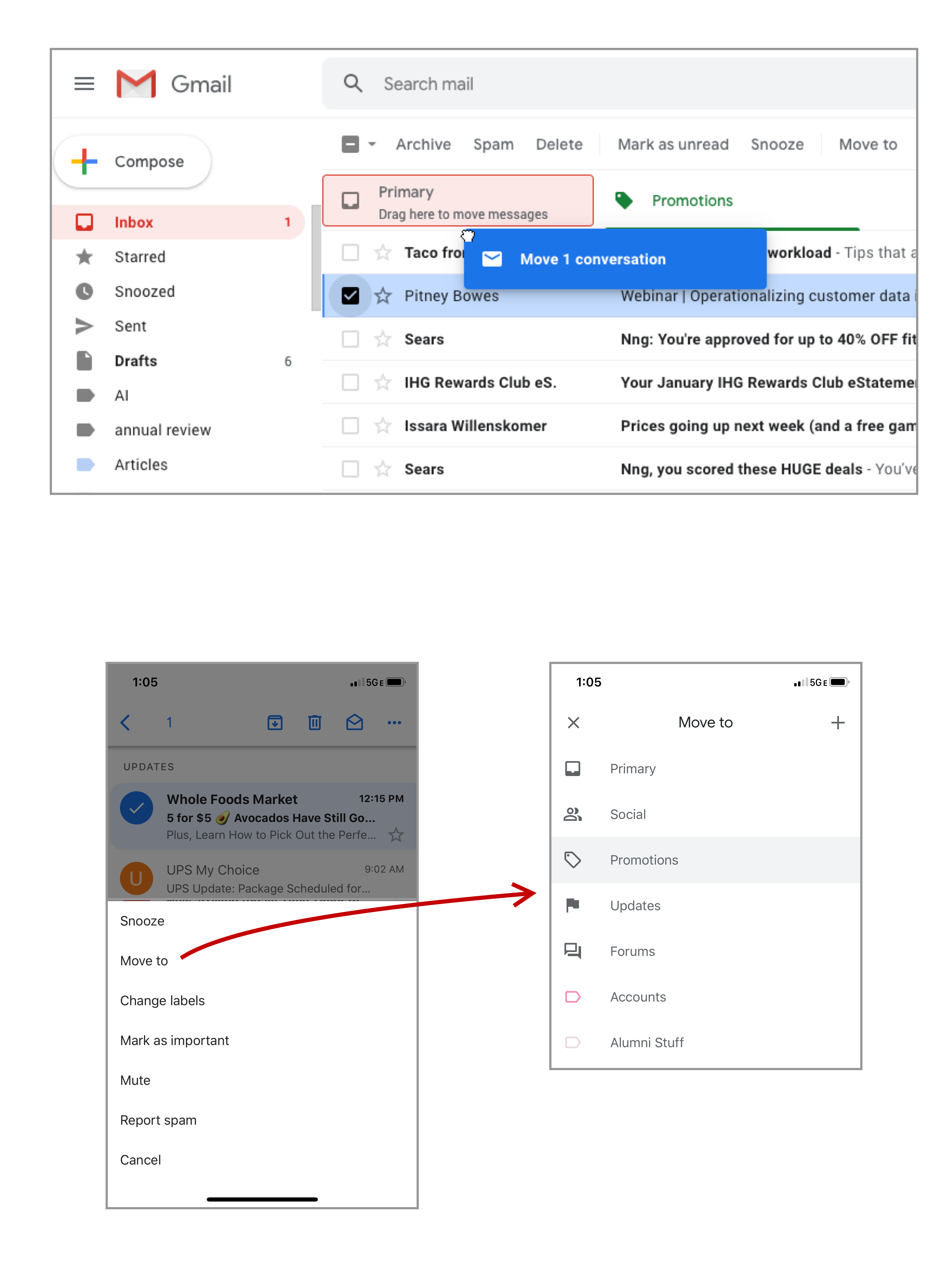
In many cases, the downsides of drag–and–drop can be addressed by an accompanying more-precise interaction; for example, dragging a shape in Photoshop can get it to the general desired area, and then arrow keys can be used to precisely position it. In some situations, alternative interactions can replace drag-and-drop completely; on mobile, for example, using menus to move a file to a different folder can be less error-prone than drag-and-drop.
When appropriate, drag–and–drop is well understood, and quickly adopted by users. All the interactions that drag–and–drop is used for can be grouped in two main types: resizing objects and moving objects. These two capabilities need different microinteraction design to succeed as intuitive, responsive interfaces.
Clear Signifiers and Feedback for Drag–and–Drop
Creating an obvious signifier for drag–and–drop is challenging. While a button can have a subtle drop shadow to indicate that it is raised and clickable, a drag–and–drop signifier has to signal two functions — (1) that the item is “grabbable” and (2) what dragging it somewhere will accomplish (moving or resizing).
There are two types of visual signifiers for grabbability: grab-handle icons and cursor changes.
Grab-Handle Icons
Grab handle icons communicate that drag–and–drop is available and provide a safe target to click and drag without activating other nearby controls. (In some applications the user need not click exactly on the grab handle icon, but its purpose remains the same.)
Unfortunately, icons in use for this purpose are not nearly as universal as designers may think and they are often a poor visual metaphor. There are several common drag–and–drop icons in use and the lack of a universal convention reduces their efficacy and recognizability.
Some of the handle icons used to signal movement are confusing also because they resemble familiar icons conventionally used for other functionalities, such as a hamburger icon or the kebab icon.
Some of these icons also attempt to indicate the direction of movement: either in one dimension (e.g. reordering a list) or two dimensions (e.g. moving a window around on a screen), but their lack of external consistency fails to communicate the purpose clearly.
For resizing, such as expanding column headers in a table or changing an object’s size on a canvas, the grab-handle icon is often pretty subtle: a single vertical line between columns, for example, or a pair of diagonal lines in the bottom right corner.
Cursor Changes
In mouse-driven interfaces, cursor changes can also be used to signal that drag–and–drop is available: as the user hovers upon an object that can be dragged–and–dropped, the cursor changes shape to indicate that clicking it will initiate a grab.
If you decide to change the cursor icon, avoid creating new, custom icons. Use the platform’s standard cursor for moving or resizing. On Macs, the standard arrow cursor will change to an open, white-gloved “Mickey Mouse” hand; this icon will further change to look like a closed hand grasping when the object is grabbed. Windows uses a white crossbar icon for drag–and–drop (typically for objects within an app or website, not for windows). For websites, CSS has a variety of classes that use the native platform icons.

When the grab is followed by resizing, a slightly different crossbar cursor icon is available. The icon shows the arrows along one axis. A diagonal icon pointing out of a window in the corner indicates that an object can be resized along two dimensions at once (both width and height).

Feedback that an Object Has Been Grabbed
Once the user has “grabbed” the object that will be dragged–and–dropped, two types of feedback are needed: (1) feedback that the object was “grabbed”, and (2) feedback previewing what will happen before the user “drops” the object.
Feedback that the object is grabbed usually makes the object look different than other similar objects on the screen; it can include the following:
- An outline or a contrasting color
- A visual presentation that makes it appear “above” other items, such as a drop shadow
- Visual offsetting of the object, such as indenting it or angling it
- A small, translucent “ghost” image of the object (for file uploading or moving between folders)
Trello uses several signals to indicate that an item is currently “grabbed” and is draggable: a slight drop shadow as well as an angle to the object indicate that it is different from the cards around it, and give the impression that it is hovering “above” the other cards and is being dragged over them. Also notable is the use of magnetism on the drop zone — the user did not need to position the item precisely over the intended location. Instead, the system provided a clear signifier (the drop zone expanding in size, changing color, and showing a subtle preview of where the object will snap) that the drop zone was active before the mouse cursor arrived there. Releasing the cursor at that point “snapped” the card to the drop zone. This interaction gives the feeling of magnetic attraction.
When dragging a file (e.g., to upload it or moving it to a different location), the cursor will typically stay unchanged, but a small, translucent “ghost” preview image of the file will be displayed. This image communicates that the file is being dragged and, when the ghost image is clear enough, helps prevent slips where a user drags the wrong file accidentally.
Especially when drag–and–drop is used to reorder a list of items, it’s important to show the background objects moving out of the way before the user releases the item. This short animation gives a preview of what will happen when the cursor is released and makes the motion feel natural. Rather than instantly redrawing the other objects in their new place, use a quick animation (roughly 100 ms) to show them moving towards their new location, in order to give the user a sense of physical manipulation of the objects. As with other types of UX motion, use easing to make the motion look natural.
One of the most complex aspects of the animated preview is deciding when to trigger the motion: should an object start moving out of the way when the edge of the grabbed object overlaps it or when the position of the mouse cursor overlaps the other object? The most natural version of this interaction uses neither — instead, it begins the reshuffling animation once the center of the dragged object overlaps the edge of the other object. This solution prevents both a “mushy”-feeling interaction (where it is slow and unresponsive), or a “twitchy”-feeling interaction (where items begin to move unexpectedly and too quickly).


Magnetism and Snapping in Place
As described by Fitts’s Law, moving the cursor to a precise location on screen is challenging, which makes drag–and–drop inherently inefficient for precise adjustments. One way to mitigate this challenge is by simulating a magnetic effect that snaps objects into place, even if the user hasn’t yet fully acquired the target. For example, a file-upload drop zone can be active slightly outside its borders, allowing users to release the mouse before they’ve gotten all the way there.
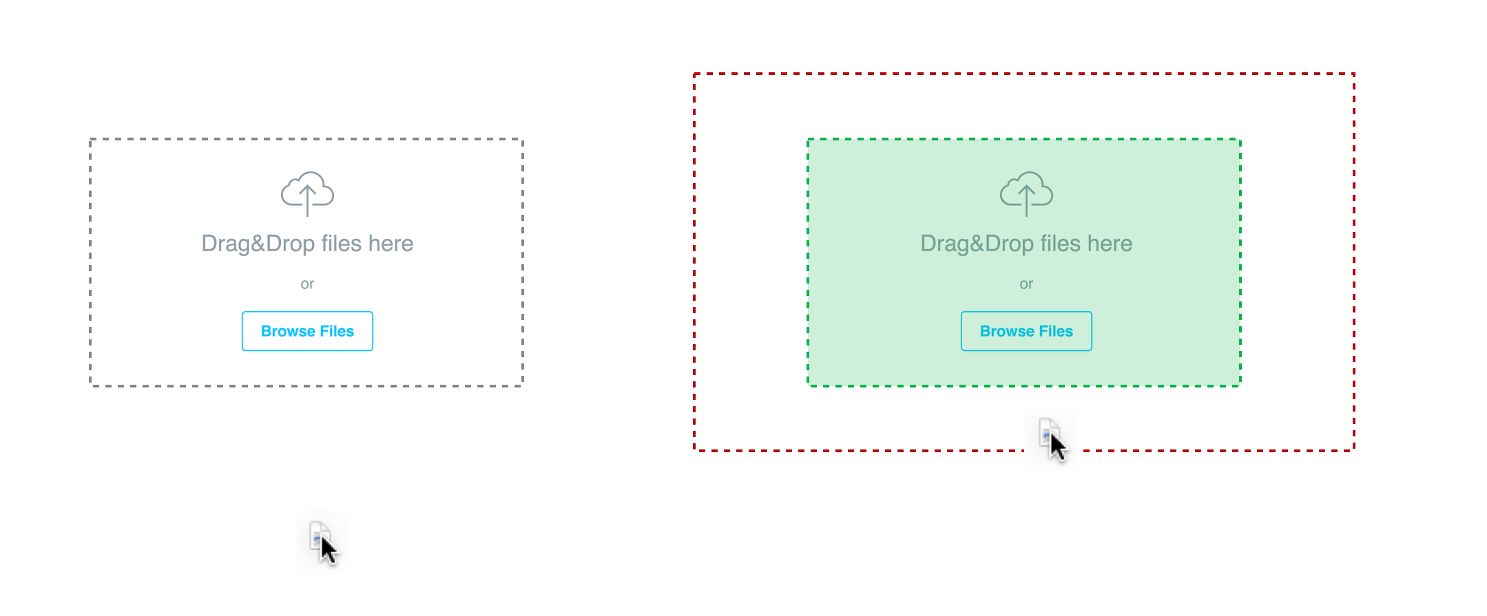
To use magnetism, you need to clearly indicate to the user when the drop zone is active, by showing a visual signifier when the dragged object is within the active drop zone (especially if the droppable area extends outside the visible border). Several common signifiers that are used for magnetism include a dotted border around the drop zone (especially common in file uploads) a highlight appearing over the drop zone when the cursor goes nearby, or an animation showing where it will snap into place before the user releases their cursor.
Chrome allows tabs to be “docked” within a window via drag–and–drop. When the user drags a tab near the tab bar, the use of magnetism allows the user to let go of the tab before reaching the destination.
Accessibility for Drag–and–Drop
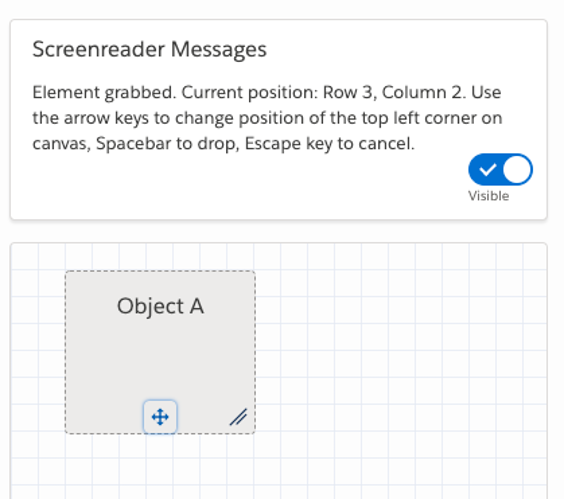
Drag–and–drop is traditionally a mouse or touchscreen-only interaction, but making it accessible for people that use assistive technologies is both completely possible and necessary. First, make sure that your handle icon is keyboard accessible with the Tab key; this enables “grabbing” the draggable item via the spacebar. Second, make sure the handle icon offers a message to screen readers that indicates what actions are available (typically using arrow keys to move or resize the object), whether it is currently “grabbed”, and its current position or size.
Drag–and–Drop on Touchscreens
Drag–and–drop can be hard to implement on touchscreens because they lack hover states, which are often used to signal the availability of drag–and–drop. Furthermore, due to the fat-finger problem, you need to ensure that draggable objects have at least 1cm x 1cm of unused space for dragging and that fingers don’t cover any important feedback (such as a highlighted “grab” state). Another important consideration is that you must distinguish among a tap, a swiping gesture (such as scrolling), and an intentional “grab” by using a timing delay of a few milliseconds, and providing clear feedback that the object has been grabbed.
One way to provide feedback on mobile for drag–and–drop is to use haptics; a subtle haptic “bump” can indicate that an object has been grabbed, and another one can indicate that an object has been dragged over a drop zone.
When adding a sticker to an Instagram story (such as this one of my dog, Daphne), users can drag–and–drop the sticker onto the desired spot. When tapping and holding, a subtle bump of haptic feedback indicates that the sticker is “grabbed” and can be moved around. Likewise, hovering the sticker over the trash-can icon provides another quick haptic bump that indicates that it can be dropped there to delete the icon.
Since hover signifiers for drag–and–drop (such as a cursor change) are not available on touchscreens, it is recommended to use drag–and–drop only when:
- You have clear evidence (from research such as usability testing) that your users expect drag–and–drop to be available, and
- There is no reasonable alternative with lower interaction cost (such as cut–and–paste or a menu-driven interaction).
Summary
Drag–and–drop is not always the best choice, but when users expect it, the familiarity of the metaphor can make the interaction relatively simple and straightforward. To make drag–and–drop as effective as possible, use appropriate signifiers, such as handle icons and hover-state cursor changes, provide clear feedback throughout the interaction, and ensure that it is accessible.


